June 30, 2012

Evolution of a Background

The third Fester Fish short, which will probably be titled "Fester Makes Friends," is still a few weeks away from completion, but I did promise to post some work from it at some point.

So here's a little step-by-step run-through of how I've been doing the backgrounds for this cartoon... First I do a loose sketch of the scene, sometimes just using the storyboard panel directly.


Then I do a loose color guide in Flash. I didn't do any color guides until this latest cartoon. Before, I would just draw the background and then mess around in Photoshop until I found some color scheme that I liked, but now I'm planning them more carefully in Flash while I can see how the characters fit into them, so that they stand out as much as possible. Although it's an extra step, it ends up taking less time in the long run because I don't have to make as many changes afterwards.


Then I draw the clean linework, and export that from Flash.


Finally I open up Photoshop, paint in all the flat colors from the guide and then start adding gradation, textures and sometimes highlights and shadows if I'm feeling saucy.


Look out for this and many other equally exciting backgrounds in the next Fester Fish cartoon coming soon. You goan love it mo den waffles. And ah KNOW you loves you some waffles.

June 27, 2012

Excited for TAAFI!

TAAFI is less than two weeks away, and I'm really excited for it! My short "Fester Goes Fishing" is going to be screened as part of the "Shorts 1 - Straight Up Toons" package, and there are a whole bunch of amazing things going on throughout the weekend. I'll be at the following events:

-"Nelvana Bouncing Ball party" on Fri. July 6
-"John K and Cartoony Animation" panel on Sat. July 7
 -"Indie Animators: Making it Work" panel on Sat. July 7
 -"Rock and Rule" screening on Sat. July 7
 -"Style vs. Design" panel on Sun. July 8
 -"Shorts 3 - Stylin'" on Sun. July 8
 -"Shorts 1 - Straight Up Toons" on Sun. July 8

I'm looking forward to seeing some fantastic animation up on the big screen at the TIFF Lightbox, the greatest theater in Toronto. See you there!

June 21, 2012

Pink Jacket Lupin 5

Here's episodes 31-38. I spoke too soon when I said that the series had gotten consistently wacky. At least the designs stabilized, fortunately into the more exaggerated ones which I preferred, but the animation still swings wildly between being delightfully crazy and being disappointingly normal. A run of largely boring-looking episodes made me lose interest a bit and slowed my progress, but things are starting to pick up now that I'm getting close to the end.


Somebody on the show really likes using multiple limbs to suggest fast, frantic movements. Obviously I'm aware of the technique, since it's used often in western animation, but for some reason I'm always surprised when I see it in anime, even in the more cartoony stuff like Lupin and Urusei Yatsura. Over the last few episodes I've seen some very fast movements that, when I still-framed them, turned out to just be a single frame. This example (above) manages to read as a frenzied tantrum between two more normal held poses. Obviously, using multiple limbs can do a lot to stretch the value of individual frames, so I'm sure the budget-minded supervisors were pleased. I know Masahito Yamashita would get in trouble for drawing too many frames.
 

Episode 31 features Fujiko's most garish outfit yet. A cross between a trench-coat and a bikini. But honestly apart from this, the fashions in the show haven't been nearly as ridiculous as I expected, given the show's reputation among Lupin fans. The pink jacket being the obvious exception, because it is pretty cheesy. I think people who aren't as interested in the animation can't really pick out what makes this series look so different, so they just pick the obvious thing, which is that it's got some 1980s fashion, and point to that as a reason for why it looks 'bad.' But taking fashion tips from Lupin is never a good idea no matter which series you're talking about-- bright red or green jackets aren't exactly normal either, and most male characters have long sideburns that are a reminder of the series' 1960s origins.


(In the picture above, the guy on the left is Lupin disguised as Zenigata, and on the right is Zenigata disguised as a guard. That's why they have the same face.)


Unusually, this English writing is basically correct, apart from some weird syntax and punctuation errors. Zeni is obviously short for Zenigata, and Tottsan is Lupin's affectionate nickname for him, usually translated as "pops" or "old man."


Despite the dodgy subtitles on my copies of the episodes, some of the verbal jokes are actually still funny. But there are a lot of moments where the subtitles say things like "this situation surprises me greatly" or "I am upset by your statement." And sometimes the nonsense subs are funny for the wrong reasons. I can't tell what this line was supposed to be:

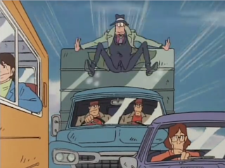
Episode 34 has a fantastic, well-animated chase scene where everyone in the entire city is armed with a machine gun and trying to kill Lupin and Jigen, even the little old ladies. The episode as a whole isn't that great, but the chase makes it one of my favourites. Lupin, and surprisingly Jigen as well, make a lot of funny noises as they run from everyone they meet.

This episode also has a little bit of background animation, which isn't something you see too much in TV animation (outside of Urusei Yatsura, which was unusually full of it).


Episode 35 is the first to feature the wonderful Yuzo Aoki-animated opening that condenses everything that I love about this series into a minute and a half.

I like this scene where all the guards from each boat keep having to jump to the next one as theirs gets sunk.


 Look at these gloriously mis-shapen hands.


Episode 37 has an interesting plot where Zenigata, smitten with a young girl who claims Lupin has wronged her, gets really serious and wants to kill Lupin. It's one of the more memorable stories, although the animation is pretty mundane for the most part.

I do love this run cycle (above) though, with Zenigata trying to chase Lupin while his head is stuck in the door of a prison cell, along with two other officers... Particularly since they forgot to actually make it look like he was stuck, so he just appears to be carrying it for no reason.


Episode 38 has lots of dolphins. LOTS of dolphins. Also some mermaids.

 It also has this face which is pretty terrible. It reminds me of a South Park design.

On a side note, I've been enjoying the new Lupin III: A Woman Called Fujiko Mine series a lot more recently. For a while it seemed to be treading water, but the main story is finally starting to unfold and it's pretty interesting. But I have enough to say about it that I'll leave it as a subject for another post, once the final episode is released so I can just write my thoughts on the series as a whole.

I have a tumblr page now

I just got a tumblr account. I don't know how much I'll use it yet. So far all I've posted are a few stupid pictures I edited of Walt Disney and the Beach Boys. Anyway, here's the link: http://aaron-long.tumblr.com/

June 04, 2012

Pink Jacket Lupin 4

This post covers Episodes 25-30.

I've now reached the halfway mark in the series, and by this point I think all the different studios working on it had realized out how much fun they were allowed to have. The character designs have become more consistent from episode to episode (relatively speaking) although there are still lots of moments where they go off-model for comic effect. It's becoming futile to try and pick out the highlights of each episode, because it's all so consistently wacky. There aren't just little spots of goofy animation here and there, they're almost constant throughout the episodes. With episode 25, I only captured about half of the shots I really liked, and even then I eventually gave up because there were just too many to stop and get them. Without a doubt, it was one of my favourites so far. And surprisingly, it wasn't even one of the Yuzo Aoki or Tatsuo Ryuno episodes.


There's a liberal amount of extra limbs peppered around this episode, mostly during the shots of Zenigata's hilarious flailing/running. He's always the most animated character in the show, but this episode especially features a ton of great scenes where he's running around frantically.


At one point, Zenigata keeps running back and forth between two locations trying to figure out what's going on (below), and they use the exact same animation each time he passes these guards. I find this hysterical because it really underscores the futility of his situation-- He's really not making any progress.


 Episode 26 is a Yuzo Aoki/Tatsuo Ryuno double-header. Zenigata playing whack-a-Lupin, dressed for some reason as a clown, is one of the best scenes yet.


It seems like at least half of the episodes in the pink jacket series are set in New York, which is one of the things that makes it feel so different from the globe-trotting second series. And of course the Gold of Babylon film is New York-based as well. The Lupin writers must've had a fetish for the city in the mid-80s.


I love the distorted perspective as Zenigata rears up to run off-screen (below).


The series seems more fully animated than many of the anime films of the time, which is really saying something given how limited most of the TV shows were. Even Urusei Yatsura, which had a very high budget for the second half of its run, can't compare to this. Of course it doesn't help that UY's budget raise coincided with the departure of its main director, and eventually signaled the end of its experimentation and loose animation. But that's a topic for another post, which I'll do sometime soon.